


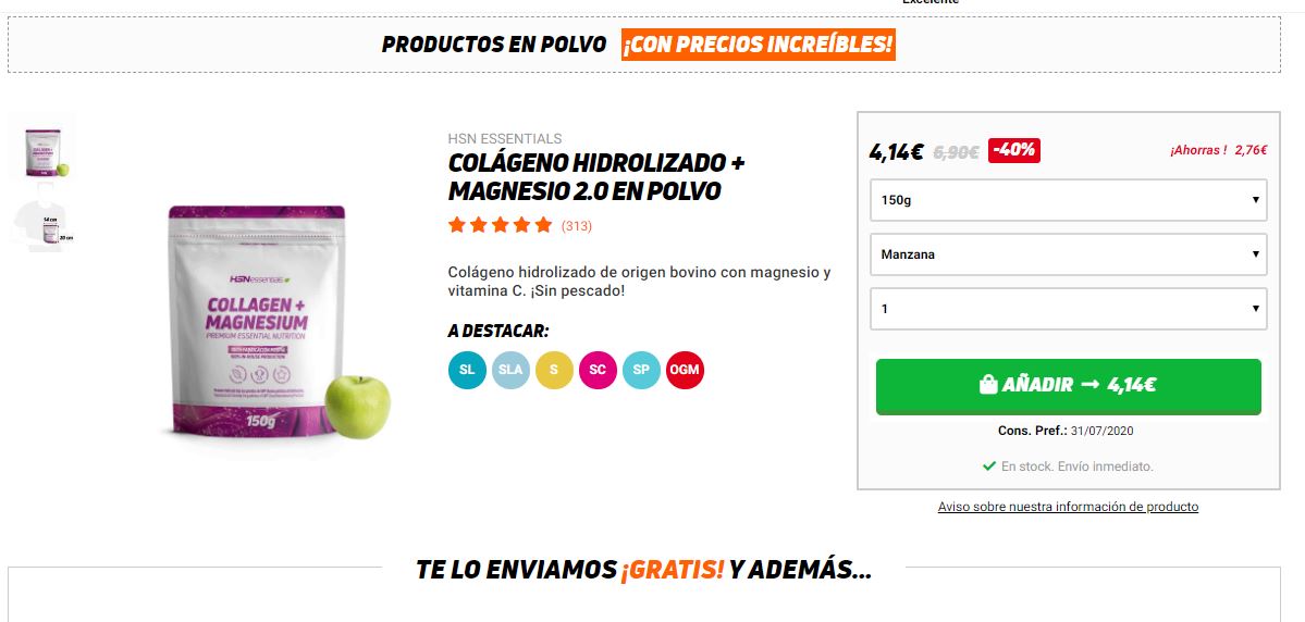
Something I am learning a lot about is optimising online store resources for SEO. At times, we worry too much about incorporating keywords, optimise the crawl budget and improve loading speed. However, we often forget a fundamental part that many SEO professionals neglect when they think that it’s a task for the UX team. I am talking about product cards.
There are three cardinal sins that are commonly made when designing product cards. Although I will be talking about them later, we could say that the most serious one is distracting the customer from what’s important. And yes, it affects SEO if that visit leaves because they can’t find what they’re looking for, or simply because we’ve made it too difficult for them. Think about it, a good product card design can speed up the purchase and reduce calls or email queries about doubts.
Contenidos
Analysing a product card
As I said, there are three basic mistakes that we can see repeated to the point of exhaustion. Leaving aside the fact that we need to bet on quality content, the fatal error is usually the lack of attention. A good product card structure should capture all the power of the product at first glance; without moving the finger or the mouse.
I want to put an example of HSN as they have been using some great SEO and CRO strategies lately. If we look at any product card on this store, we’ll see that everything is literally perfect.
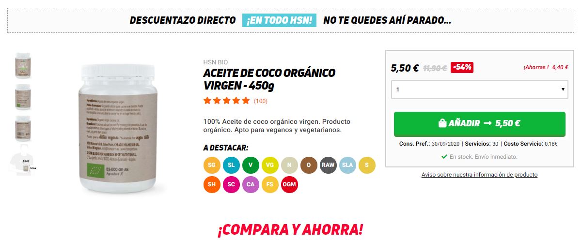
Product card on HSN.
If you analyse this product card, you can identify all the information you need to make a purchase at a glance and without making scroll actions.
- On the left, the product image and gallery.
- Then, the title with a good H1 and ratings.
- This part is great, a well-written description. Cut straight to the point.
- Additionals details like the legend.
- On the right, the elements related to payment. Price, quantities and shipping.
If we look at the mobile version, the order is very similar, only the price is fixed at the bottom so that the customer has it easy.
Non-essential items, at the bottom
The mistake of filling the product card with too many elements has been a common one. The more loaded it is, the cooler it seems. Doesn’t it? But no. The clearer the potential customer is about what they’re buying, the better.
This is why it’s a good idea to use short descriptions, a clear message and the rest in the background. Generally, users don’t scroll past the middle of the page, so the initial message in the short description must be convincing. Let alone on mobile. Always, there will be users who will ask about the “compound biorganic astrophysical” of your olive oil, but that information can be in the background, not at the first contact.
Opt-in and Popup on the product card
Be careful with this point. It’s an error to use popups. Whatever you thought and made you decide that adding a popup to a product card would be a good idea, you were wrong. The customer cannot be bothered when they’re shopping. You’re going to put a simple example that will make you understand it quickly:
Have you ever been to a Chinese bazaar? Have you felt how they were chasing and watching you? That’s how the visitor feels when they have popups while shopping.
You can use them, but it’s better to do it with a clear head. For example, you can programme an emergent to activate when the user goes to close the page or change the tab. Or, do it when they abandon a cart. You have a thousand ways to make it right, even when they finish the purchase. But what about if they haven’t even added anything to the cart? Forget about that.